Choosing the best neutral colors for interior paint can transform your home into a calm, inviting space you’ll love coming back to. But with so many options—like soft grays, warm beiges, or even muted greens—it’s easy to feel overwhelmed.
What if you could pick colors that not only match your style but also make your rooms feel bigger, cozier, or more sophisticated? In this guide, you’ll discover the top neutral shades that work perfectly in any room, how to use them to highlight your favorite accents, and simple tips to make your space look effortlessly stylish.
Ready to find the perfect neutral paint for your home? Let’s dive in!

Credit: thistlewoodfarms.com
Classic Neutral Shades
Classic neutral shades have stood the test of time in interior design. They create a calm and balanced atmosphere in any space. These colors work well with many styles and color accents. Choosing classic neutrals ensures your home feels inviting and timeless.
They provide a perfect backdrop for furniture and decor. Classic neutrals also help brighten rooms or add subtle depth. These colors never overpower but enhance the overall look of your interiors.
White And Off-white Options
White is the cleanest and brightest neutral color. It opens up spaces and reflects natural light well. Off-white shades add softness without losing brightness. These options make rooms feel fresh and spacious. They pair easily with any accent color or style.
Black For Contrast
Black adds drama and sophistication to interiors. Use it as an accent or for trim to create a sharp contrast. It highlights architectural details and anchors the room’s design. Black works well with lighter neutrals to balance the overall look.
Gray Variations
Gray offers many shades from light silver to deep charcoal. It adds a modern and calming touch. Cooler grays bring freshness, while warmer grays create coziness. Gray blends well with both bright and muted colors. It suits contemporary and classic interiors alike.
Warm Beige And Cream Tones
Beige and cream tones bring warmth and comfort to any room. These colors create a soft, natural feel. They look great with wood and earth-toned decor. Warm neutrals make spaces feel inviting without being dull. They are ideal for living rooms and bedrooms.
Credit: janovic.com
Sophisticated Neutral Choices
Sophisticated neutral colors create a refined and timeless atmosphere in any room. These tones offer subtle elegance without overwhelming the space. They work well with many design styles and accent colors. Choosing the right neutral can set the mood and enhance natural light. Below are some top sophisticated neutral choices that add depth and warmth to interiors.
Navy Blue As A Neutral
Navy blue acts like a dark neutral with a rich tone. It adds depth without feeling as harsh as black. This color pairs beautifully with whites, creams, and soft grays. Navy blue creates a calm, classic look perfect for living rooms and bedrooms. It also complements wood and metallic accents well. Using navy as a neutral base allows bold colors to pop.
Taupe’s Versatility
Taupe blends brown and gray in a warm, inviting way. This color works well in both modern and traditional spaces. Taupe serves as a perfect backdrop for colorful or neutral furnishings. It adapts easily to different lighting conditions, appearing warmer or cooler. Taupe walls create a cozy, elegant environment that feels balanced and natural.
Earthy Olive Green
Olive green is an earthy neutral with a muted, natural vibe. It brings a grounded, organic feel to interiors. This color pairs well with wood tones, creams, and deep blues. Olive green adds subtle color while maintaining a calm, neutral look. It works beautifully in kitchens, living areas, and bedrooms for a peaceful, sophisticated touch.
Choosing Undertones
Choosing the right undertone is key when picking neutral paint colors. Undertones are subtle hints of color beneath the main shade. They can be warm, cool, or neutral. These undertones affect how the paint looks in your space. Understanding them helps create the desired mood and harmony in your room.
Warm Undertones For Cozy Spaces
Warm undertones include hints of yellow, red, or orange. These colors make a room feel inviting and snug. They suit living rooms, bedrooms, and areas meant for relaxation. Warm neutrals like beige, cream, and taupe add a soft glow. They bring warmth without overwhelming the space.
Cool Undertones For Calm Ambiance
Cool undertones show shades of blue, green, or gray. These tones create a peaceful and fresh atmosphere. They work well in bathrooms, kitchens, and offices. Cool neutrals like soft gray or pale blue calm the mind. They help rooms feel spacious and clean.
Matching Undertones To Lighting
Lighting changes how paint colors appear. Natural light brings out true undertones during the day. Warm artificial light enhances warm undertones. Cool artificial light highlights cool undertones. Test paint samples in different lights before deciding. This prevents surprises and ensures the color fits your space perfectly.

Credit: roomfortuesday.com
Using Neutrals In Different Rooms
Neutral colors create a calm and balanced atmosphere in any room. Their versatility allows easy pairing with furniture and décor. Choosing the right neutral shade can enhance each room’s purpose and mood. Below, explore how to use neutrals effectively in different spaces.
Living Room Neutrals
Warm beige and soft gray work well in living rooms. They create a welcoming space that feels open and airy. Light taupe adds subtle warmth without overwhelming the room. These shades allow colorful accessories to stand out. Darker neutrals like charcoal can add depth and sophistication. Use neutrals on walls and large furniture to keep the room flexible.
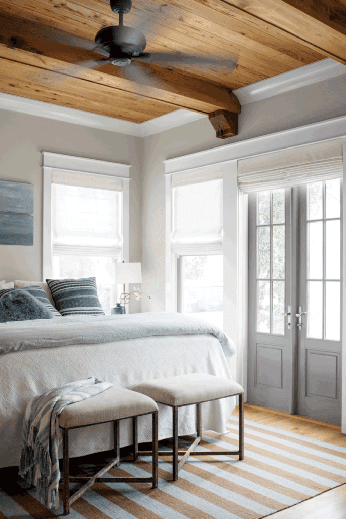
Bedroom Calm With Soft Shades
Soft neutrals like cream, pale gray, or muted blush promote rest and relaxation. These colors help create a peaceful retreat for better sleep. Avoid dark or bold neutrals that might feel too intense. Light tones reflect natural light, making the bedroom feel more spacious. Pair with soft textiles and minimal décor for a soothing effect.
Kitchen And Dining Areas
Neutral walls in kitchens provide a clean backdrop for cabinets and appliances. Warm beige and light gray are popular choices. They brighten the space and complement wood or metal finishes. In dining areas, soft neutrals encourage a cozy yet elegant atmosphere. Consider durable, washable paint to handle kitchen messes while maintaining style.
Bathrooms And Small Spaces
Light neutrals like white, ivory, or pale gray help small spaces feel larger. These colors reflect light and keep bathrooms fresh and clean-looking. Soft taupe and cool gray add subtle interest without shrinking the room. Avoid very dark neutrals in small areas as they can make the space feel cramped. Use moisture-resistant paint for durability in bathrooms.
Combining Neutrals With Texture
Neutral colors provide a calm and flexible base for any room. Adding texture creates interest and warmth. Texture breaks up flat surfaces and makes a space feel inviting. Combining neutral tones with varied textures brings life to simple shades. It enhances the subtle beauty of beige, gray, taupe, and cream.
Layering Fabrics And Materials
Mix soft fabrics like linen, cotton, and wool for cozy layers. Add natural materials such as wood, stone, and metal for balance. Layered textiles in neutral tones create comfort and style. Different textures catch light differently, adding depth without bold colors. This approach suits sofas, curtains, rugs, and cushions alike.
Adding Depth With Textured Paint Finishes
Choose paint with a subtle texture for a unique wall effect. Options include matte plaster, sand-infused paint, or suede finishes. These finishes add tactile interest to neutral walls. Textured paint softens the look of plain colors. It helps hide imperfections and gives walls a richer feel.
Balancing Matte And Glossy Surfaces
Combine matte and glossy finishes to create contrast and harmony. Use matte on large areas like walls for a calm backdrop. Apply glossy finishes on trims, doors, or furniture for highlights. Gloss reflects light and adds brightness to neutral palettes. This mix prevents a room from looking dull or flat.
Pairing Neutrals With Accent Colors
Neutral colors create a calm and balanced base for any room. Pairing them with accent colors adds personality and style. Accent colors can change the mood of the space. They bring life to neutral walls without overwhelming the room. Choosing the right accent colors enhances the beauty of neutral paint. Here are some great ways to pair neutrals with accent colors.
Bold Accent Colors For Impact
Bold accent colors create a strong visual effect against neutral walls. Bright reds, deep blues, and vibrant yellows add energy and excitement. These colors draw attention and make a statement. Use bold accents in furniture, pillows, or artwork for a lively look. They contrast well with soft beige, gray, or white backgrounds. This pairing works well in modern or eclectic interiors.
Soft Pastels For Subtle Contrast
Soft pastels add gentle contrast to neutral paint. Light pinks, mint greens, and pale blues create a soothing feel. These colors blend smoothly with warm beige or cool gray tones. Pastel accents bring freshness without harshness. Use them in curtains, rugs, or decorative items for a calm, inviting space. This combination suits bedrooms and living rooms with a relaxed vibe.
Metallic Accents And Neutrals
Metallic accents add shine and elegance to neutral rooms. Gold, silver, and bronze highlight the subtle beauty of neutrals. These accents work well with gray, taupe, and cream walls. Use metallic finishes in lamps, frames, or hardware for a touch of glamour. They bring warmth and texture without overpowering the neutral base. This style fits both classic and contemporary interiors.
Factors Influencing Neutral Choice
Choosing the right neutral paint color depends on several key factors. These factors help create a balanced and inviting space. Neutral shades vary widely, so understanding what influences your choice is essential.
Each room’s unique features affect how neutral tones look and feel. The direction the room faces and the natural light it receives play a big role. Furniture and decor colors also impact the final look. Your personal taste and current design trends guide the selection process too.
Room Orientation And Natural Light
The amount of sunlight a room gets changes how paint colors appear. North-facing rooms often have cooler, dimmer light. Warm neutrals like beige or taupe can add warmth here. South-facing rooms get bright, warm light. Cooler neutrals such as soft gray work well in these spaces. East and west-facing rooms experience changing light throughout the day. Choose flexible neutrals that look good in both warm and cool light.
Existing Furniture And Decor
Neutral paint must complement the furniture and decorations. Dark wood furniture pairs well with lighter neutrals like cream or ivory. Light-colored furniture can stand out against soft gray or taupe walls. Consider the style of your decor too. Traditional styles suit warm neutrals. Modern designs often fit better with cooler tones. Balance is key to avoid clashing or dullness.
Personal Style And Trends
Your style influences neutral color choices greatly. Some prefer timeless, classic neutrals like white or beige. Others lean toward trendy shades such as greige or muted greens. Trends can add freshness but may date quickly. Choose colors that reflect your personality and feel comfortable long term. Neutrals offer a perfect base for evolving styles and seasonal accents.
Tips For Painting With Neutrals
Painting with neutral colors creates calm and timeless spaces. These shades work well in any room and match many styles. Using neutrals needs careful choices to keep rooms interesting and inviting. Follow these tips to achieve the best results with neutral paints.
Testing Samples In Different Lights
Paint small patches on walls before buying large amounts. Observe them at different times of day. Natural light shows true color in the morning and afternoon. Artificial lights at night can change the paint’s look. Testing helps avoid surprises and ensures you like the shade all day long.
Using Neutral Palettes For Flow
Choose neutral colors that connect rooms smoothly. Use similar tones in adjacent areas to create harmony. This makes your home feel larger and more open. Mix warm and cool neutrals carefully to keep balance. A soft beige in the living room can lead to a gentle gray in the hallway.
Maintaining Balance And Harmony
Neutral walls need accents to avoid dullness. Add texture with fabrics, rugs, or furniture in varying shades. Use light and dark neutrals to give depth and interest. Avoid all one tone; this can feel flat and cold. Balance creates a warm, welcoming space that feels complete.
Conclusion
Choosing the best neutral colors makes your space feel calm and inviting. Shades like gray, beige, taupe, and soft white work well in any room. These colors create a perfect background for your furniture and decorations. You can mix warm and cool tones to match your style and mood.
Remember, neutral paints help brighten rooms and make them look bigger. Use these colors to build a timeless, cozy home that suits your taste. Simple, versatile, and elegant—neutral colors always stay in style.